Well it seems that I think about advertisements, specifically the billboard signs from STL to OMAHA! Lets just say that there are many complaints about these billboards.
When driving on the interstate, we are bombard with 1000s of distractions, many of which can take our eyes off the road for more then a second. If you are driving at 60 mph, that is 88 feet of road you will not see. A lot can happen in 88 feet.
The problem with these billboard signs are that they can distract drivers why to much, trying to figure out what they say. Either the font is to small or there happens to be way to much information. All of this combined makes driving more distracting. Now knowing what I mean? Look below:

Look past the typo, but look at how much information is on that billboard sign. For a driver to read everything on that sign, they would have to look at it for about 5-10 seconds. That is dangerous, and very ineffective for the business.

again we are presented with way to much information that a driver can not obtain the information quickly and effectively. A designer needs to be able to keep it simple to leave enough questions that make the driver think about the billboard, make them want more. Like these creative billboards:

I am not a fan of McDonald's, however they have some great advertisements. This ad, we automatically know that it is McD's ad. It features some food items that are very noticeable at a distance. Finally featuring a sun dial that tells you what to order. This ad leaves the driver interested and the seed of food is placed in their minds. Very little wording is used, but we know what it is about quickly. I could look at this less then 1 second and know what it is about.
Here is another one:
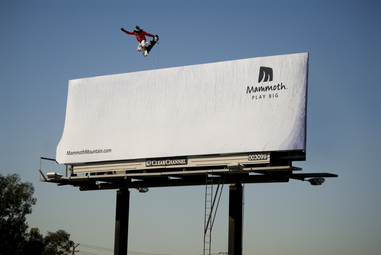
This one is beautiful. I don't know what this company is, however with a quick look I am presented with a white background and a snowboarder in the air. I automatically associate that with a ski resort. We have the words Mammoth, Play Big and then their website. That little information I know that my first thoughts were correct. I am left with wanting to know more. I just wish the website was a little larger.
Lastly:
I was going to use an Apple billboard because they are so simple but I found this one:
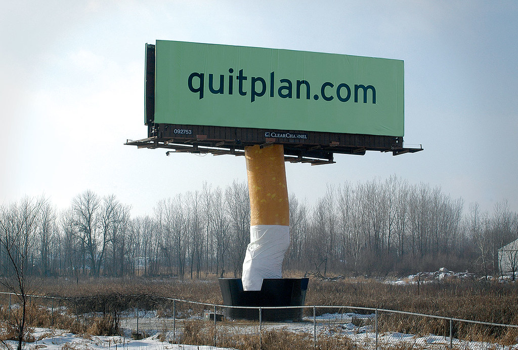
This is AMAZING! We are presented with a website, and that is all. We have the cigarette at the support beam and what looks like an ash tray. This is very iconographic that the driver will know immediately what "quitplan.com" is about. I can look at this image in under 1 second and know all the information I need to know.
As a driver I hate being distracted by over complicated billboards that have so much information I get lost. I will be honest I have found myself looking at a billboard for a few seconds trying to figure it out sometimes.
If you are a graphic designer for billboards, keep this in mind:
1) Make it interesting to capture the driver's attention:
(could not find the 'WOW' sign)

2) Keep it simple, yet informative:

Brilliant, The name pops, I am left wanting more. I know what they are about, and I can google them if I forget the number.
3) Don't get to informative:
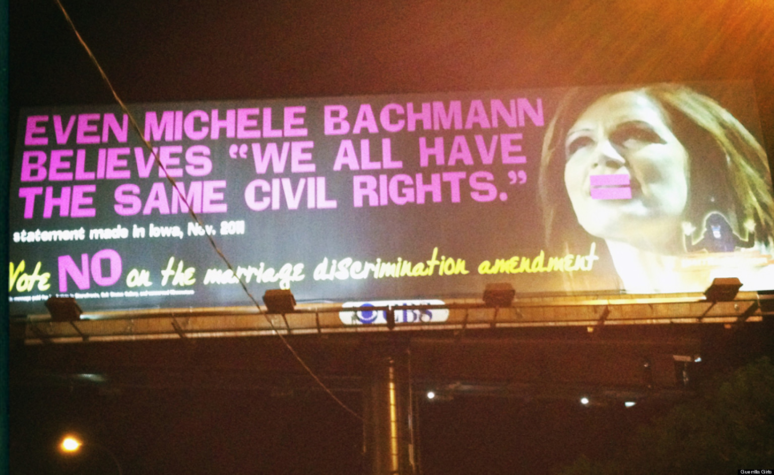
WAY to many words for support equal rights. Font is written very strange, can't understand what is going on. Why is the equal sign on her lips.
Finally:
4) Leave me wanting to know more:

beautiful! simple effective.
OK, I am done with my billboards! Have a great week and stay creative!
Daniel Sukup
No comments:
Post a Comment